
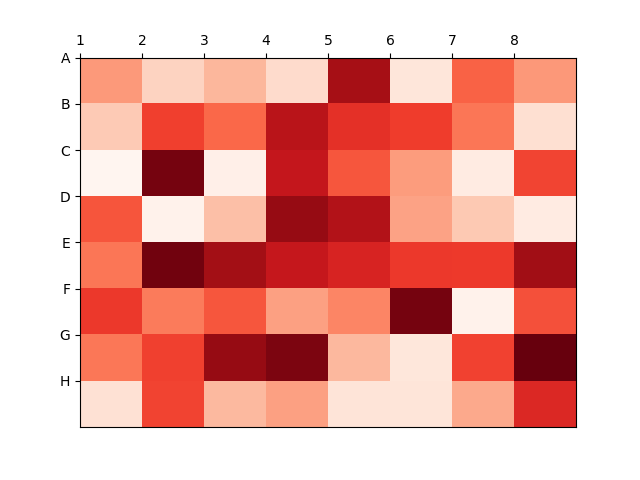
Heatmap to display labels for the columns and rows and display the data in the proper orientation
Table like display
import matplotlib.pyplot as plt
import numpy as np

column_labels = list('ABCDEFGH')
row_labels = list('12345678')

data = np.random.rand(8, 8)

fig, ax = plt.subplots()
heatmap = ax.pcolor(data, cmap=plt.cm.Reds)

# Put the major ticks at the middle of each cell
ax.set_xticks(np.arange(data.shape[0]), minor=False)
ax.set_yticks(np.arange(data.shape[0]), minor=False)

# Want a more natural, table-like display
ax.invert_yaxis()
ax.xaxis.tick_top()

ax.set_xticklabels(row_labels, minor=False)
ax.set_yticklabels(column_labels, minor=False)

plt.show()
The following is the output that will be obtained:
2018-10-27T09:32:30+05:30
2018-10-27T09:32:30+05:30
Amit Arora
Amit Arora
Python Programming Tutorial
Python
Practical Solution