
How to draw bar chart with group data in X-axis with Matplotlib?
Bar chart with group data:
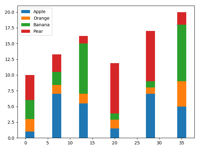
import pandas as pd
import matplotlib.pyplot as plt

df = pd.DataFrame([[1, 2, 3, 4], [7, 1.4, 2.1, 2.8], [5.5, 1.5, 8, 1.2],
                   [1.5, 1.4, 1, 8], [7, 1, 1, 8], [5, 4, 9, 2]],
                  columns=['Apple', 'Orange', 'Banana', 'Pear'],
                  index=[1, 7, 13, 20, 28, 35])
width = 2
bottom = 0

for i in df.columns:
    plt.bar(df.index, df[i], width=width, bottom=bottom)
    bottom += df[i]

plt.legend(df.columns)
plt.tight_layout()

# Display the graph on the screen
plt.show()
The following is the output that will be obtained:
2018-10-28T06:33:58+05:30
2018-10-28T06:33:58+05:30
Amit Arora
Amit Arora
Python Programming Tutorial
Python
Practical Solution